Sunday, July 11, 2010

Stuttgart, June 22

Today we went to the overly prestigious Porche Museum designed by Delugan Meissl. Truly a heavenly experience as describe by the tour guide. As we ascended into the “heaven’s”, it was obvious why this design of the building was chosen, it reflects the car company; flashy, showy and expensive. A beautiful building nonetheless, I am reminded what someone said to me, “this building would probably fall down easily in an earthquake”. This building reflects on of the age old question in architecture, should a building give up its aesthetics for its function, or in this case the structure integrity of the building. After all there was a lot of wasted space in the building, but it looked good, and if you have the money and dreams then go for it.

The second car museum we saw was the Mercedes-Benz Museum. Although not a direct opposite of the museum, the architecture reflected the car company; innovation and engineering. The museum felt more like a science center than a car museum, different from the Porche Museum which just had cars on display, the Mercedes Benz Museum had interactive exhibits, similar to the BMW Welt, with its key feature being a simulated tornado that can be formed through the core space that broke the Guinness Book of World Records for the strongest artificially created tornado in the world. The building was a trefoil spiral that started at the top that wound its way down towards the bottom with the exhibit following in chronological order from the use of horse travel to the newest innovations in alternative energy. The building was over all very impressive and is still requiring me to wrap my head around the circulation and structure of the building. After this, we had a short lunch at a pizza place where one person had to cook 10 pizzas in 20 minutes, which to my surprise, she did. Unfornutaley I got wrapped up in the confusion and chaos and ordered a tuna pizza. I would not recommend this as a topping.We went to the Weissenhof, a modernist development in Stuttgart with houses designed by Mies van der Rohe, LeCorbusier and Walter Gropius. Similar to the Bauhaus, the buildings were plain and simple yet elegantly beautiful. These were interesting houses that are classics of modern architecture exhibiting LeCorubusier 5 Pillars of Architecture; a pilotis system, open floor plan, free façade, horizontal windows and rooftop garden. The development was a futuristic look at what a neighborhood could be like with housing built according to modernist architecture. The neighborhood had a bit of charm to it, from what I remember and the place was quite nice. The proportions of the buildings were to scale of the human figure and the views out over the city were beautiful. This was the first building I had seen by LeCorbusier with his rooftop gardens, part of his idea of the 5 pillars of architecture

The day winded down with a drive-by of the extremely post modern Statsgallerie by James Sterling. This building was like a Roman ruin with Lego bricks added to it. We then headed back to the hotel.

Friday, July 9, 2010

Munich

We arrived in Munich under gray skies and cold weather. I swear I saw a snowflake… in June… in Southern Germany. I’m sure the city was ready to roll out the snowplows within the night. Not really, but I think I made my point, it was cold. Munich, the largest town in Southern Germany, is the capital of Bavaria. This being said, I was expecting people to be walking around in lederhosen and to see a beer hall at every corner; after all it is home to the largest Hofbrauhaus (beer hall) in the world. I thought it would be the equivalent to New Orleans in Germany; a place that would exploit its Germanic past and heritage on every street corner. But Munich is a modern, clean city that once held the infamous 1972 Olympics and has grown up since the days of the Hitler’s Beer Hall Putsch. As we were walking through the city our first night there, we came to a street lined with expensive, boutique shops and expensive BMW’s and Mercedes Benz’s speeding up and down the streets. And then I realized… I was back in Dallas. The city seemed extremely wealthy with freeways everywhere and tall, modern skyscrapers dotting the city skyline. This thought was confirmed with a visit to the audaciously designed BMW Welt, a showroom experience designed by Coop Himmelb(l)au, across the street from their headquarters, to exhibit their latest cars and innovative engineering so those wealthy enough to buy their car from here could drive off in a perfect setting. The place was amazing in the design of the building.
Afterwards, a smaller group of us went to the Herz-Jesu-Kirshe (Sacred Heart of Jesus Church). Designed by the firm Allman, Sattler, and Wappner, it is a large wooden box surrounded by a blue glass box that manipulates the light. On the outside glass wall, the material becomes more opaque closer to the altar while the slats that make up the wooden box open up more to allow more light in the closer to the altar. An extreme amount of detail is carried through the whole building: carpenter nails make a silhouette on the blue glass, crosses are subtly seen in the facade, and extreme detail is given in how the wood and steel come together.

The Ghosts of Berlin

Monuments are an integral part of the Berlin urban fabric and have been a hot topic issue for Germans since the inception of the merger of Berlin and Colln. The most interesting and controversial monument we saw in Berlin was the Soviet war memorial in Treptow Park. This memorial was based on an extremely axial condition with two large pink granite gates flanking each size at Star Wars proportions as one enters the memorial. As one enters the memorial, the Soviet soldier at the end cannot be missed as it rises 30 feet into the air holding a sword in one hand and a child in the other. This memorial is a decry to the Germans of World War II showing the Soviets defeat over the Germans and how the Russians are a more superior people than the Germans. After all the Germans saw the Russians, like the Serbs, as an inferior race and felt they needed to be exterminated. Today the memorial stands in a peaceful park in the former East Berlin, previously owned by the Soviets. The memorial is a statue of a Russian soldier stepping on a swastika humiliated the Germans, almost in a sign of German inferiority. The question though that many Germans had to struggle with is should this memorial be kept on the soil of a newly unified Germany. This was answered in the unification of the two Germans states in a treaty where Germany promised to keep the Soviet memorials. In my opinion, it is important to keep the memorial as a reminder to the German people about what happened during such a tumultuous time in the world’s history. Keeping this memorial, and other Soviet and communist memorials of the former GDR, is a way for the Germans to stop ignoring their past and embrace who they are and where they come from, something many Germans have had to struggle with. At the time of the reunification, and even true today, the memorial was seen as an open wound in the painful history. Over time these memorials, like the Soviet Memorial in Treptow Park, will “become invisible, or they may, like the Victory Column, become Berlin landmarks”, adding another layer to the complex German history.

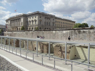
Another memorial important within the Berlin urban fabric are the Nazi sites scattered about the city. Nothing upsets Germans about their history more than the awful acts of the Third Reich, Hitler and the followers of the Nazi regime. Within Berlin, there are only a few Nazi sites that were left after the British and American bombing of Berlin and the Soviet occupation in the Battle of Berlin. One of the most important sites in the history of the Nazi’s is the Topography of Terror. Originally a temporary exhibit when it opened in 1985, it has grown to be a permanent museum dedicated to the research and display of the SS actions and Gestapo headquarters that was initiated by Hitler through his secret police. The site exists on a former SS underground bunker and is located on the former site of the Gestapo headquarters. The permanent exhibit space pays homage to the site with a simple glass box with a tube steel framed lattice work that wraps the building acting as a sun screen. The whole site is empty except for part of the Wall that was saved on the edge of the property, the bunkers that line the site, and gravel that covers the entire area. I felt that this minimalism in the site was very well done showing an empty “hole” in the urban fabric, and also referring to the hole that the Nazi’s left in the history of Germany. It feels like a barren wasteland and an unfriendly place to be, but holds a bold and important statement in the city that cannot be missed by the casual visitor.